Never judge a book by its cover. Ironically, Jane Austen initially referred to Pride and Prejudice, by the title First Impressions. Fans of Jane Austen know better than to judge a book by its cover, and must strive to go beyond first impressions and get to know her characters on a deeper level. Cue the debonair Mr. Darcy.
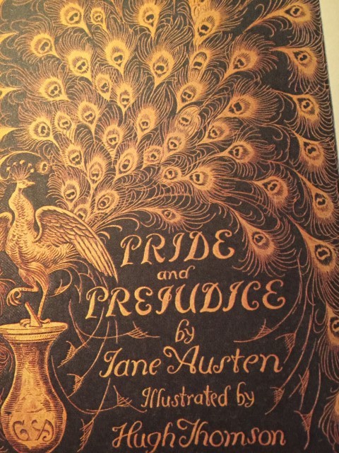
But, in the world of graphical design and book publishing, first impressions are everything. Most of us, unfortunately, are also swayed by the book’s cover. Jane Austen Cover to Cover, is not just a celebration of the author’s celebrated stories. For lovers of design and Jane Austen’s six books, this is truly a wonderful collection that incorporates two centuries of design, from elegant Victorian hardcovers and the famed 1894 “Peacock” edition to 1950s pulp, movie tie-in editions, graphic novels, foreign-language translations, and more.
As you follow along on a journey across the years, you will also be part of an adventure through the various forms of graphical evolution, from handset typography to digital technology. The artwork is beautiful and the insightful commentary makes this wonderful collection a must for Janeites, design geeks, and book lovers of every stripe.
What is interesting (and not at all surprising) is that despite the various incarnations of the cover, the underlying text remains constant. Score one for the writers.
“No matter how beautiful, tacky, infuriating, beguiling, silly or strange the packaging may be, the story inside never changes. And that, after all, is the most important thing.”
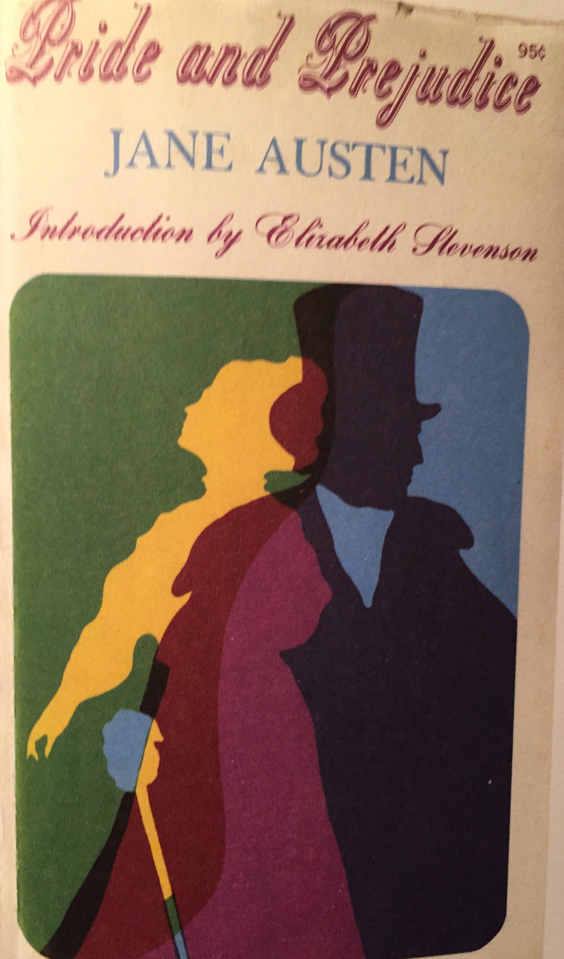
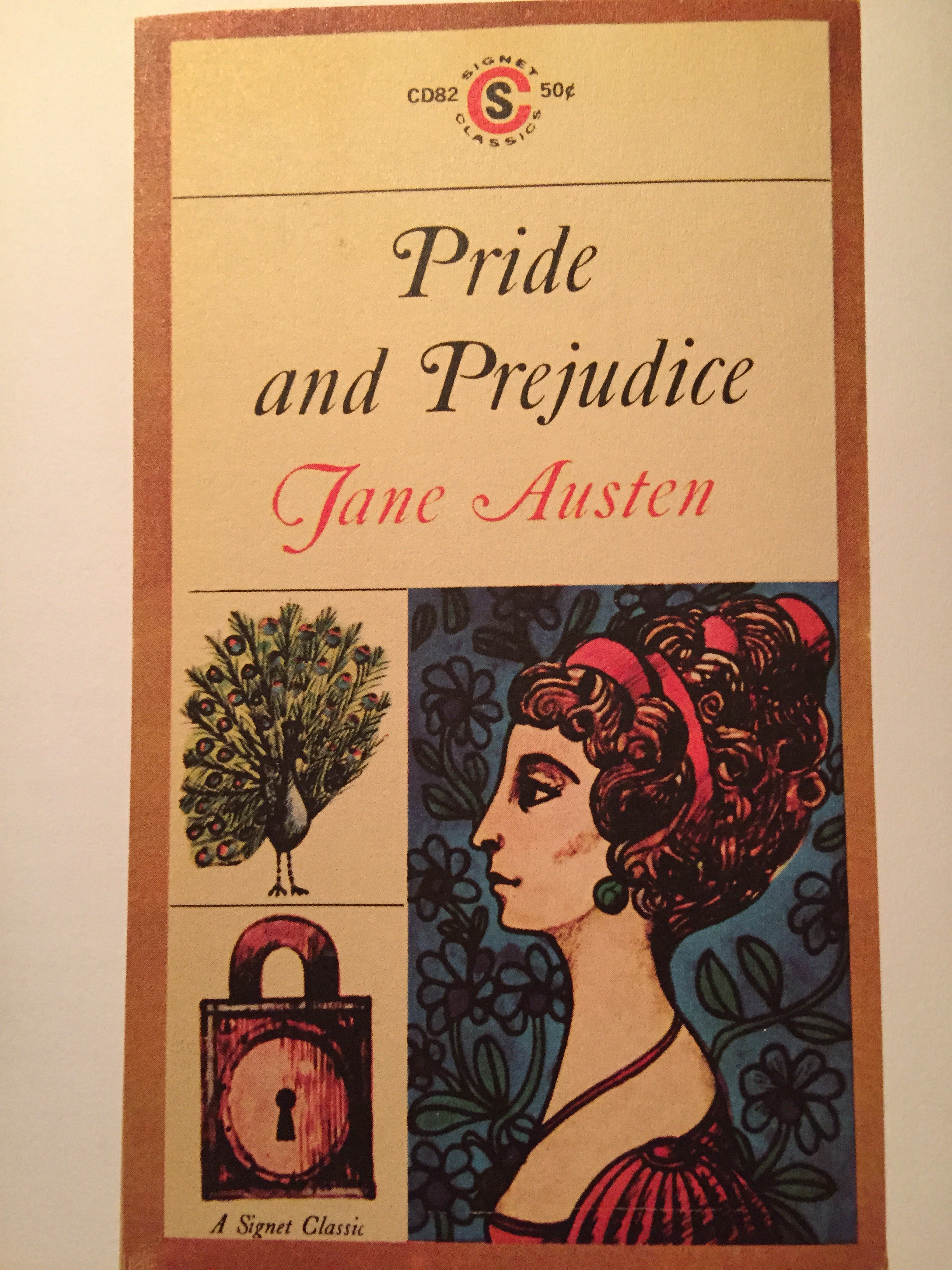
Midcentury Jane (1960s and 1970s) proved to be too hip for Jane Austen. As new approaches to studying literature came about, the classical tradition seemed to be scorned in favour of the minimalist New Criticism, which concentrated solely on text and excluded historical or biographical context. Paperback readership, was skyrocketing, thanks to the advent of romance publishers such as Harlequin and Silhouette. Austen’s books were repackaged to suit the trend. Original cover illustrations featured scenes from the book in a literal and representational, albeit not historically accurate, way.